CSS Grid Layout
CSS Grid Layout
Two-dimensional grid-based layout system aligns elements into columns and rows.
Basic definition
1
2
3
4
5
6
7
8
9
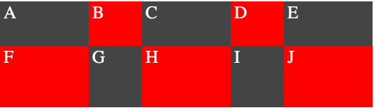
| .wrapper {
display: grid;
grid-template-columns: 100px 60px 100px 60px 100px;
grid-template-rows: 50px 70px;
}
.b, .d, .f, .h, .j {
background-color: red;
}
|
Grid Area
1
2
3
4
5
6
7
8
9
10
11
12
13
14
| .a{
grid-column-start: 1;
grid-column-end: 2;
grid-row-start: 1;
grid-row-end: 2;
}
.a{
grid-column: 1 / 2;
grid-row: 1 / 2;
}
.a{
//notice the sequence is row-start/column-start/row-end/column-end
grid-area: 1 / 1 / 2 / 2;
}
|
So
1
2
3
4
5
6
7
8
9
10
11
12
13
14
15
16
17
18
19
20
21
22
23
24
25
26
27
28
29
30
31
32
33
34
35
| .wrapper {
display: grid;
grid-template-columns: 100px 10px 100px 10px 100px 10px 100px;
grid-template-rows: auto 10px auto 10px auto;
}
.a{
grid-area: 1 / 1 / 2 / 2;
}
.b {
grid-area: 1 / 3 / 2 /4;
}
.c {
grid-area: 1 / 5 / 2 / 6;
}
.d {
grid-area: 1 / 7 / 2 / 8;
}
.e {
grid-area: 3 / 1 / 4 / 2;
}
.f {
grid-area: 3 / 3 / 4 / 4;
}
.g {
grid-area: 3 / 5 / 4 / 6;
}
.h {
grid-area: 3 / 7 / 4 / 8;
}
.i {
grid-area: 5 / 1 / 6 / 2;
}
.j {
grid-area: 5 / 3 / 6 / 4;
}
|
looks like this
Repeat and Span
1
2
3
| //repeat function
grid-template-columns:repeat(6, (col) 100px (gutter) 10px);
grid-template-rows: repeat(4, (row) auto (gutter) 10px );
|
1
2
3
| //span merge lines
grid-column: col / span gutter 2;
grid-row: row;
|
Grid Template Area
1
2
3
4
5
6
7
8
9
10
11
12
13
14
15
16
17
18
19
20
21
22
23
24
25
26
27
28
29
30
31
32
33
34
35
36
37
38
39
40
41
| .sidebar {
grid-area: sidebar;
}
.sidebar2 {
grid-area: sidebar2;
}
.content {
grid-area: content;
}
.header {
grid-area: header;
}
.footer {
grid-area: footer;
}
@media only screen and (min-width: 400px) and (max-width: 540px) {
.wrapper {
display: grid;
grid-template-columns: 20% 5% auto;
grid-template-rows: auto;
grid-template-areas:
"header header header"
"sidebar . content"
"sidebar2 sidebar2 sidebar2"
"footer footer footer";
}
}
@media only screen and (min-width: 540px) {
.wrapper {
display: grid;
grid-template-columns: 100px 20px auto 20px 100px;
grid-template-rows: auto;
grid-template-areas:
"header header header header header"
"sidebar . content . sidebar2"
"footer footer footer footer footer";
max-width: 600px;
}
}
|